During fall 2019, we conducted an assessment of the current Lenoir-Rhyne website, which turned three years old in August 2019. In this post, we provide details on what we learned from our review and from conversations with faculty, staff, students and alumni.
The findings were presented to several campus groups and can be found in this Web Redesign Assessment PowerPoint Presentation.
Background
- Current website was launched in August 2016 following a redesign project that took place in 2015-2016.
- Website content is managed in Finalsite, a content management system (CMS) that is primarily used by K-12 schools. In 2016, a five-year contract was signed with Finalsite through May 2021.
- Website management and content updates are centralized in the Marketing and Communications office.
Website Assessment
- Branding and design
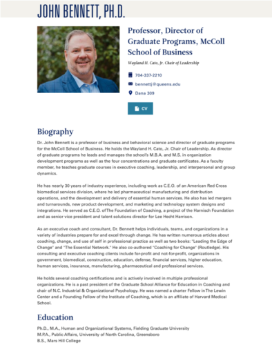
The current website does a poor job communicating the Lenoir-Rhyne brand, university hallmarks and differentiators that set LR apart from competitors. Site design and typography is poor, site photography is often repeated, cliché or posed photography and there is limited use of video across the site. - Poor user experience / site usability
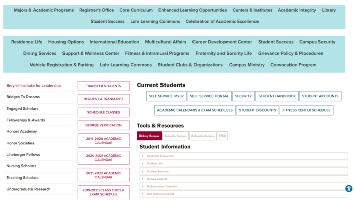
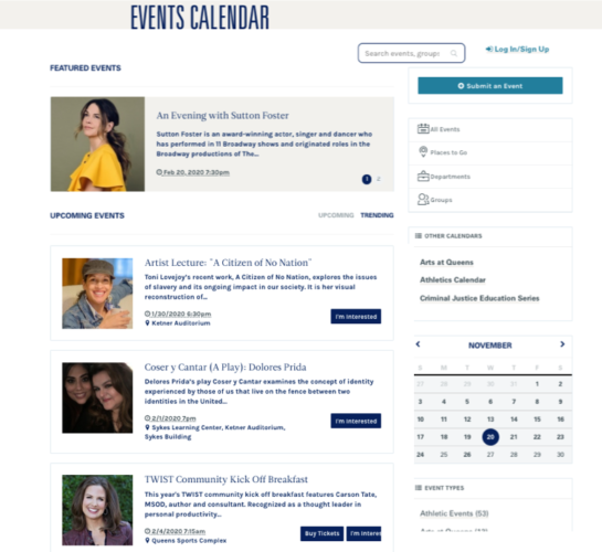
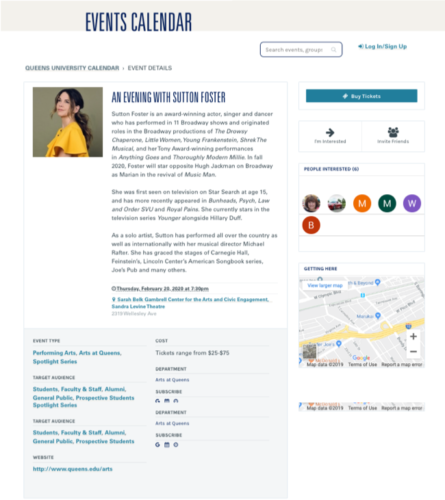
The site features inconsistent navigation (it’s unusual to find centered navigation on a higher education website), inconsistent header styles, content is often buried inside accordions and tabs, there is an overuse of buttons and content often opens in pop-up windows that aren’t directly linkable or indexable by search engines, e.g., university calendar, campus directory listings, tuition information, among others. There is poor content prioritization and editing and “chunking” of content that is easily scannable by visitors. The site lacks clear calls to action on pages. - Accessibility and web standards compliance
Website does not comply with federally mandated accessibility requirements, which require compliance with WCAG 2.0 Level A and Level AA or Section 508 (2017). University websites need to be accessible to all individuals, including those who use assistive technologies or have visual, hearing, motor or other impairments. - Search Engine Optimization (SEO) issues
Not all content is findable by search engines, e.g., campus directory information, faculty pages, calendar content. Page headings are not structured for optimal SEO. - Academic pages
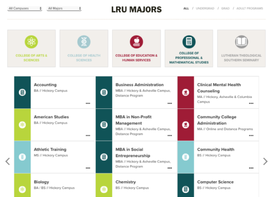
- Majors/programs selection page is difficult to use on desktop computers and on mobile devices.
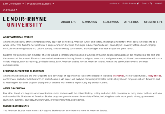
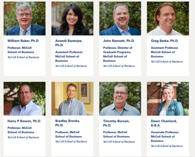
- Academic pages are text heavy, offer no photography or video, no faculty pages, missing important content about the student experience and outcomes, e.g., testimonials, internships/careers, study abroad, student-faculty research/scholarship, student organizations, civic engagement, etc. Course listing and descriptions are also not provided.
- Site doesn’t include a listing of minors.
- Campus audiences – Asheville, Columbia and LTSS campus content is limited and offers poor user experience. Visitors to these campus pages are often pushed back to main site.
MyLR Portal Intranet
The MyLR Portal or LR intranet was launched in fall 2016 on Microsoft Sharepoint. Content on the site is updated primarily by IT staff. Some initial training was provided to LR faculty and staff, but many have found updating the intranet to be difficult.
Updating any website via a content management system can be difficult for infrequent users as they have to relearn the software each time they use it if they make just a few updates to the site each year.
MyLR Portal Assessment
- No clear strategy – what should our intranet/portal support?
- Design and user experience – inconsistent design. Issues with content organization, content quality, etc.
- No news, announcements or events integration – lost opportunity to push people to a central site for campus announcements, events, etc.
- Unclear site audiences – student and employee information is intermixed.
- Hickory-centric – Columbia campus is buried under the academics section. LTSS and Asheville don’t have a presence.
- Not all offices/departments have a portal presence
- What content should be on public vs internal site?
Looking Forward to the Next LR.edu
- Focus groups and campus input sessions
- Request for Proposal (RFP) – details our needs, priorities and strategy. Sent to vendors with extensive experience working with colleges and universities
- Vendor/partner selection – select an external vendor to assist us with the redesign and development of a new website, provide ongoing maintenance, support and development
- Technology review and selection – alignment of technology to support our priorities and strategy and to grow with us
- Transparent process – updates shared regularly through redesign blog.
- Further study feasibility of considering web redesign and MyLR Portal/ intranet redesign projects and needs together. This would allow us to leverage our investment in our public website, develop, support and train on a single technology platform.
- Redesign Project timeline – 9-12 months. New website would launch in summer 2021.
Web Redesign Priorities
- Strong design aesthetic that clearly communicates and leverages the strengths of the LR brand.
- Focus on greatly improved user experience and site usability
- Content strategy
- Web standards and accessibility compliance
- Responsive design
- Search engine optimization (SEO)
- Flexible, modular or component drive site design allowing for maximum design flexibility
- Content syndication, content sharing – Create Once, Share Everywhere or COPE.
- Investigate feasibility of content personalization
Path Forward – Digital Footprint
- Focus on storytelling across platforms
- Fully leverage an integrated marketing and communications strategy – web, email, video, social media, digital ads, paid content, email, text messaging, earned media.
- Implement a robust content strategy that is in alignment with new LR brand messaging.
- Use organic, paid digital and social to expand our reach using new strategies and tactics—geofencing, IP targeting, behavioral advertising, retargeting, etc.
- Third-party validation through earned media


