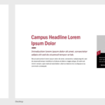
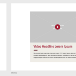
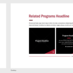
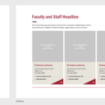
In a previous post, I shared the initial design explorations for the new website that included both design elements (purposeful elements that are the foundational building blocks of a design system, e.g., color, iconography, typography, etc.) and design patterns (functional and repeatable configurations of elements that perform specific functions through user interaction (buttons, inputs, dropdowns, etc.).
In this post, you will find designs for the various components that will be seen throughout the new website. Components convey meaning by combining patterns to support specific content types, e.g., carousels, menus, accordions, media types, content featurettes, etc.
Content Types
Before building out website components, we identified and matched up website content types for design and function. Here are some, but not all, of the content types we have accounted for in a variety of components so far.
- Acalog (catalog) Integration
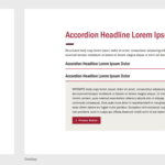
- Accordions
- Aggregate Result Cards
- Differentiator Slider
- Emergency Alert
- Faculty & Staff
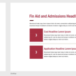
- Financial Aid & Admission
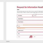
- Forms
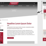
- Heading/Intro Copy
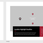
- Key Points & Location
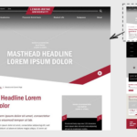
- Masthead
- Media Component
- My LR Experience
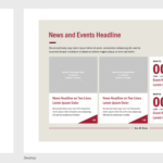
- News & Events
- Page Navigation
- Pagination
- Programs
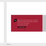
- Pull Quotes
- Quick Links
- RFI – Request for Information form
- Side-rail Components (appear below page navigation)
- WYSIWYG – What You See is What You Get (HTML content area)
Component Designs

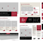
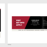
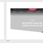
View of many website design components, including primary navigation, masthead image/video, interactive elements for photos, videos and content features, news and events, footer, etc.
