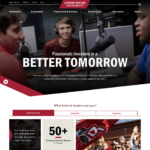
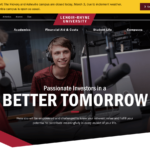
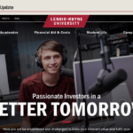
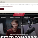
We are excited to unveil the design for LR’s new homepage. To get this point, we have carried forward what we have learned through each stage in the redesign project so far.
- Content Strategy – We started with an approved content strategy. Through our content strategy work, we identified more than 15 different content types.
- Design Exploration – Content strategy work informed our design exploration, which set the design direction (visual language) for the new website.
- Component Library – We create a large number of components in our component library to serve all of our different content types.
- Interior Templates – We created more than 14 interior templates that are strategically used to help arrange content in the component library to serve the purpose of pages. The interior template work informs what we are doing with the homepage since we’ve put a lot of thought into the content types and components used throughout the rest of the site.
Homepage Strategy
We started with an approved content strategy to determine the purpose of the homepage. Here is what we aligned on with the homepage.
- LR’s Brand Story – Tell LR’s unique brand story and encourage users to engage and learn more.
- Establish LR’s Identity – Paint a broad overview around some key content and messages that will help establish LR’s identity by showcasing the university’s core offerings, location and atmosphere.
- Differentiate LR – Draw visitors in through aspirational headlines that reflect the LR student experience like “Passionate Investors in a Better Tomorrow.” Use ambient, b-roll video that provides a high-level introduction to the LR brand story and the collective experience of students and the value of that experience today and into the future.
- Personalize Content to Each Audience – Since LR serves several different types (undergraduate, graduate and seminary students) and locations (Hickory, Asheville, Columbia and online), we ask visitors to self-identify through the “What kind of student are you?” This allows us to personalize content to each type of student—undergraduate, graduate, seminary—and showcase LR messaging, programs and experiences for each specific visitor type.
- Highlight LR’s Strengths – In the Undergraduate tab, we highlight one of LR’s strengths, small class sizes and an abundance of academic offerings that provide students with the individual attention and edge they need to reach their goals. This fits well with what we heard during project discovery of LR being a small, welcoming and supportive community “small in size, not in opportunity.” Similar messaging and information will be provided in the graduate and seminary tabs specific to the experiences of these groups.
- Student and Alumni Testimonials – Throughout the website, we will utlize student and young alumni testimonials to help tell the LR story through the experience of our students. All student/alumni stories will be housed under an LR Experience area under student life.
- Location – Provide links and information about each campus location. For undergraduate this is Hickory, for graduate this is Hickory, Asheville and Columbia and for seminary this is Columbia.
- News & Events – We feature two news stories and two events on the homepage and link off to their respective locations.
- Footer – In the homepage footer (and the footer for the entire site), we provide clear admission calls to action (Visit, Get Info and Apply). We also provide links to important webpages, legal information and social media websites.
Flexibility
We have built flexibility into the homepage by planning for the display of both photography and video. Each photo area on the page can display either a video or store up to five different photos that will randomly appear on page load. This keeps the page looking fresh and engaging versus utilizing the same images each time the page loads.


